From the Vault: Lhurgoyf 8th Ed (2003) Pt. 5
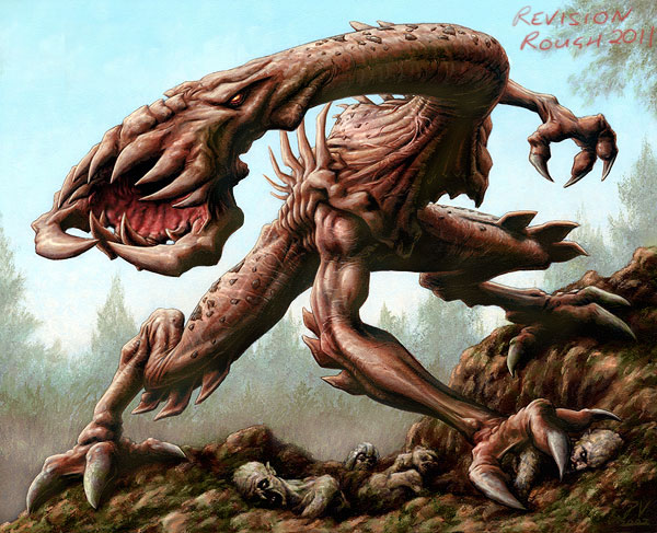
So, which version of the Lhurgoyf was I happier with; Ice Age or 8th? Well, Ice Age gets the nostalgia vote but 8th is a better painting – as I’d hope given that over half a decade separates them – but unfortunately some of that didn’t translated as well to final print size as I would have liked. If I’m looking at the two originals then I prefer the newest. If I’m looking at the printed versions then I like them equally; this probably means I didn’t take reduction into account enough when doing the new piece. Also the new piece was painted about twice the size of the old version so these things can be more difficult to get right the greater the reduction to final print size.
Maybe with more time I’d have given the new Lhurgoyf a little bolder texture, hard to say. The only unfortunate thing about the actual printed card is that it dropped out a few of the mid tones (a printing issue I would spot again throughout Mirrodin and especially on Tanglewalker). The printing made the image more heavily contrasted which has the benefit of increasing the dynamism but at the expense of the subtler qualities that make the creature’s skin look more realistic.
Looking at it with eyes that are – and this amazes me – almost a decade older than when I painted it, I would have done these things to the 8th edition version.
Remove the leaves in the upper left. They’re unnecessary and exaggerate the artificial framing going on with the trees.
Add stronger texture and some stronger color variation in it’s skin.
Maybe add some more mist to the trees and definitely some greenery mixed in with the foreground mud.
Make the shadows less black and more appropriate for daylight. The shadow would be riddled with warm reflective colors off the ground and ambient light from the sky.
Fixed the shape of its gums. The original sketch shows more curvature. It’s not much but I think the final version is a little flat.
Okay, let’s try that. Through the magic of digital here’s a QUICK tweak.

Hmm, interesting. I think some of the colors brought into the shadows aren’t really showing up here (damn you jpeg compression!) but many of the other tweaks are plain to see.
Let me know what you think.

Coooooooooooooooooooooooool. Great read! Excellent art!