W.I.P. – New Baron Sengir 1 – Prep Work
Time to start tackling the repaint of the Baron Sengir calendar picture. But first…
Via the magic of the internet and the timely scanning of the calendar by KavuMonarch, here’s the John Bolton painting that replaced my version in the 97 calendar. The scan, as KavuMonarch says, isn’t perfect but it does the job.
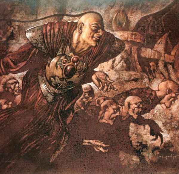
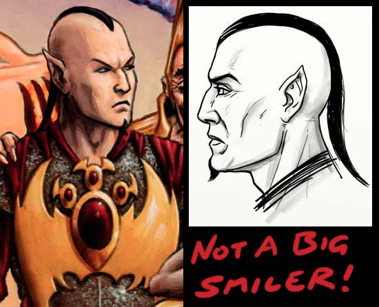
I still think it’s a cool painting, it’s just not the show-stopper I remember. I think the Baron’s ‘smile’ and the weird positioning of his arm are what hurt it most. No offense to John, I just don’t think it’s close to his best work. I like the sepia tone look, maybe because it was so radically different from my own take, but the little chin beard should be hooked and Sengir has rather a Greek nose. Here’s an example of both facial features from a close up of Drawn Together (Unhinged). Somewhere tucked away I have the 360° turnaround drawings that I did for the Baron’s sculpture (which was made for the Japanese market way back in 96), but rather than dig that up, let me give you a new drawing after all these flashbacks –
Let’s get on with the repaint…
First thing to do is change the image dimensions. The calendar called for a 12″ by 12″ square and I’ve gotta tell you a square is lousy for single figure images. Also – surprise, surprise – I plan to make the new image into a limited edition print so I want it to fit standard print sizes. I use Photoshop to pull the Baron free from the background (courtesy of the wonderful Quick Selection Tool) and then resize the background and use a little bit of Content-Aware Fill (fun, but no miracle-worker) and some block-color to fill out the image.
Looking closer, one of the elements that’s really going to benefit from a repaint is the fire and its reflections. Using actual paint the border between an orange and a blue can be very troublesome to do well and this… well, this was a screw up. That ugly green halo is just … yuk. The reason that regular physical paint can struggle with this and digital doesn’t is a little thing called subtractive light versus additive light. Well, that and digital can paint a warm yellow over a deep blue and not have its color polluted.
Oh, and from now on, when I say left, just assume the left of the image, not for instance, his left hand which would actually be on the right of the picture. I’ll stick to left is the left as you look at it to keep thinks simple. I think. Anyone confused yet?
I lengthen his gown and tweak a variety of elements on the Baron. I’m surprised to find the need to shorten and widen his skull. It’s subtle, but here’s a before and after…
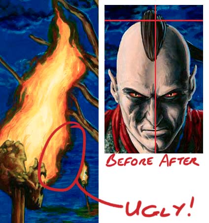
I broaden the Baron’s shoulders and chest and lengthen the lower torso. The original has the Baron floating toward you with his head and shoulders leading his legs, he’s probably at about a 30° angle. The problem is that the Baron’s outfit is all flowing drapery and this disguises the positioning of his body and just makes his lower half seem stunted. I’m trying to bring his body closer to level with the viewer, lengthening the figure and filling out the new image dimensions better (bonus!). Here’s another before and after, you can see the significant lengthening of the armor at his waist. I bend the left arm to make it seem less rigid. I tidy up the drape of his gown and pull the whole figure to the left to balance the fact that many elements are being blown to the right by a breeze. Here’s another before and after that seems to make the change to the Baron’s head more obvious than the close up. Now that is weird.
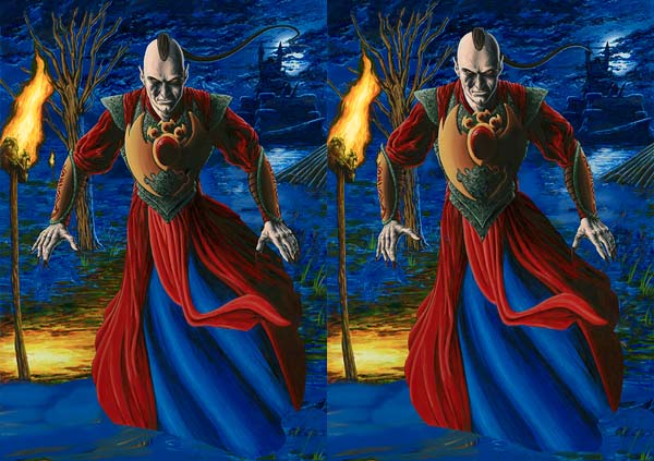
I decide to make the Baron’s hands more menacing. This also gives me a chance to play with Photoshop CS5’s fancy new Puppet Warp tool, repositioning all the fingers. In this image, the upper row are the original hands, the lower the digitally tweaked ones. I begin to suspect I may have overdone it though. I wanted to give the hands a hint of impending violence, but maybe the subtle option is more appropriate for someone as cunning as Baron Sengir. The final nail in the coffin is when I realize that combined with the position of his arms the new tension in his hands makes me expect he’s about to go for his six guns. Yeah, not good.
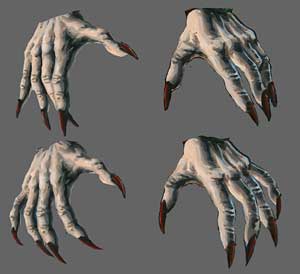
After some tweaking I decide to go with the original left hand (with its fingers lengthened fractionally) and the new right hand. I knew I wasn’t going to go with the original right hand no matter what. I mean, what the hell is the deal with that third finger?
So here’s the current state of play. The figure is more upright and better proportioned and also fills the image better. There are tweaks throughout (even the hair which is a little less crazy) and a very rough placement for the gown.
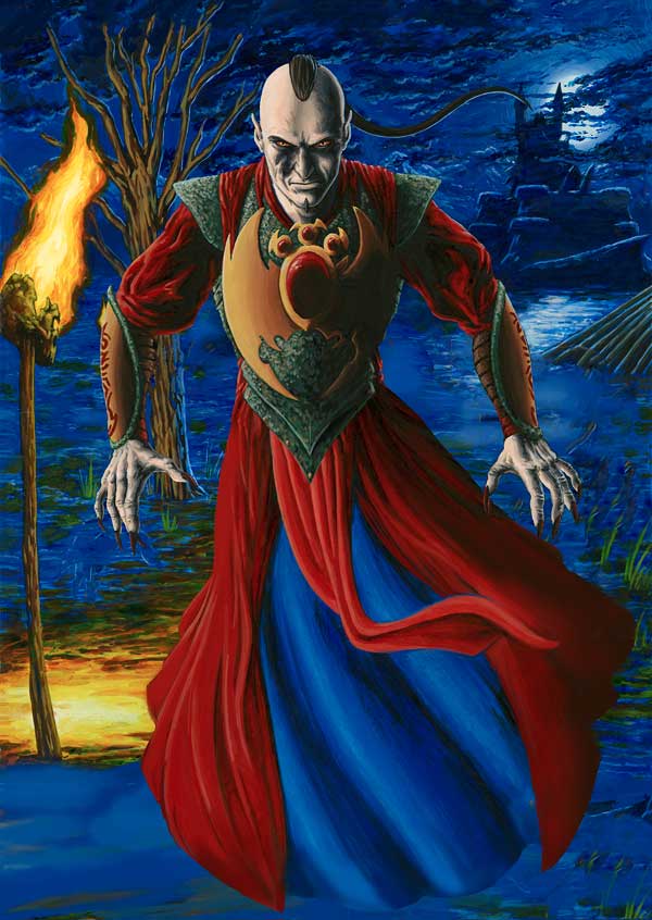
There’s just one problem. A big one. I’m not sure the Baron’s pose is interesting. It’s very stiff. He might be floating there (he does float, btw, walking is for peons) waiting to block the passage of someone foolish enough to enter his lands. Maybe. But I’m just not sure that concept is enough to save the pose. I decide to do a quick breakdown of the body’s position in the old and new versions. I think when you can see the figure the original position of the body is actually better than the new one but all bets are off when the flowing drapery is added.
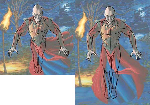
Hrm.
So, I put it to you, should I:
- Go with something close to the original pose.
- Something like the revised version.
- A completely new version of the figure.
- A completely new version of the figure WITH A SWORD! This sword, actually, taken from a Sketchathon piece.
Tell me what you think. Leave a comment here or anywhere I’ve linked to this article.
~ by Pete Venters on October 15, 2010.
Posted in Art, W.I.P.
Tags: Baron Sengir, Magic the Gathering, Repaint, WIP
6 Responses to “W.I.P. – New Baron Sengir 1 – Prep Work”
Comments are closed.

I’d vote for the new figure with the sword. I like sharp pointy things!
maura, that was my vote, too. Sword, sword!
I think the pose of the new version is better. And the old Baron don’t need a sword. His mere glance is enough to petrify their victims.
The new version is an improvement over the old one but the old one was so awkward to begin with. I didn’t see him as floating until you mentioned it, I thought he just stood there at a strange angle. I’ll vote for new figure, with sword! That shoots chainsaws! Okay, just a sword.
I vote for the new pose with a little more fore ground to make obvious the floatingness. Sword might be over kill but some narrative element to give a clue as to why he might be hovering in a menacing night scape would be good.
I find one huge problem with drawing floating figures is how to denote the float. The motion is so gradual in hover mode that it is hard to place in a still image, one suggestion might be to calm the background so that he is the only thing in motion. (ie. vertical flames, less clouds) That might hash the background though. Hmm….. I’m out of good notions. I had hope that would take longer.:)
I’m gonna say, something like the new version AND a completely new version with a sword!, it’s a cool character after all.