
W.I.P. ““ Weighing the Options for the New Baron
Thank you all for your feedback!
Unsurprisingly, the vote favored a new pose for the Baron which is probably for the best. However, the issue of whether to include a sword split the ranks pretty evenly so I’m leaving that option open for now.
Now to address a few things directly;
The tree – I probably should have mentioned this in my last post but the tree was never going to stay as it fights for dominance with the Baron. If it does return (and I do mean if) its colors will be very muted. It’ll also be completely redesigned as that is one sorry-ass stunted tree at the moment.
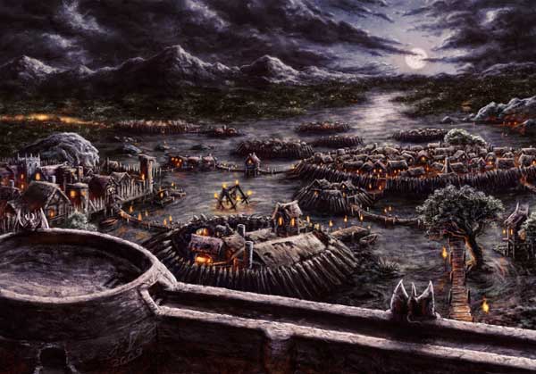
The burning skull torch is likely to stay as it’s my primary light source allowing me to render the Baron in something other than the colors of night. The torches dotted around the Dark Barony from the 2010 release Planechase are those same burning skulls. The Baron likes to remind people that they are one wrong step from becoming decor…
Also there were comments regarding the fact that the Baron had never been shown with a sword before or that the calendar image lacked the contemplative facial expression of the original. I don’t see these things as issues. This comes down to how I’ve always interpreted him versus how the public has. There’s been very few images of the Baron and what each of us imagines beyond the iconic card image is going to be very very different given the limited amount of canonical information.
I’ve always thought of the Baron as the General of an army, or more precisely an army-to-be. His plan is to build a vast vampiric legion and march out into the multiverse. The sword isn’t something he needs for battle, it’s a symbol of his authority. It’s also an affectation much like his grandiose breast plate. What, you think that’s the most comfortable outfit the Baron could find in his room full of wardrobes?!
Finally, I’m unlikely to show the Baron’s feet. I’ve always pictured his gown as floor length and that the blue under-gown magically merges with the night. It’s less clear on the calendar image because the whole image is so bright and saturated but if you look at the card image you’ll see the blue of his gown is not only similar to the night sky but suspiciously low on folds or details. Also, take a look at this sword picture again and you’ll see his gown dissipates there too.
I already tackled a few sketches, but nothing I’m happy with yet. This is going to take a little more time than the simple repaint I had originally intended.