
The Art of the Signature
I always imagine pieces of fantasy artwork as windows into another world. Given that, I find an artist’s signature that is very visible, even dominating, to be very jarring and disruptive when attempting to soak in a scene.
Don’t get me wrong, there’s no right way to do these things. Some people’s signatures are practically a work of art unto themselves. Others, are vivid stamps of ownership. That’s just not to my taste.
In most of my pieces I keep my signature subtle, using colors from within the image and only rarely placing them against strongly contrasting colors. There are some Magic pieces where the only way you would ever see the signature would be to hold the original painting; the signature is minutely different in color to its background.
And then there are the occasions where I make the signature part of the decor, or an integral part of the image.
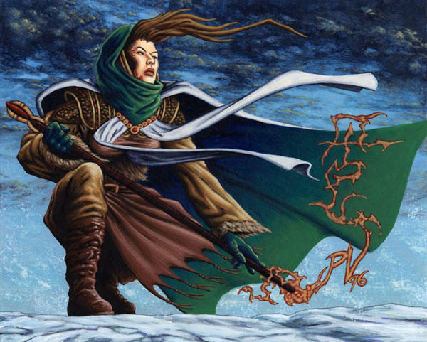
Wandering Mage was one of my favorite paintings I created for Alliances. I was especially fond of the gentle gradation from blue to green on the inside of her cloak – that’s no mean feat when the blue-greens are highly pigmented and non-opaque, and you’re still learning the ropes of this thing called ‘painting’.
I don’t remember anymore if I decided to get creative with the signature from the outset of the sketch or late into the painting. I suspect it may have been the latter as I often don’t like to mess with a good background and the moody clouds and the barren snowy plains didn’t seem like they’d benefit from the addition of my scrawl.
The mage is casting a wayfinding spell to help guide her across the barren snowy wastes. The upper part of the coiling magic creates an arrow, but if you look in the lower right of the spell effect you will find my signature staring back at you. Some people see it instantly while others have to have it pointed out to them. I figure that means I got the balance just right.
And no, I have no clue why R&D made her Summon-Cleric. Them crazy kids.
In the case of Necromancy (Visions) I’d tried to make an image that was the last word in undead magic. The card (before it was radically re-tooled at the last minute) was supposed to be Magic’s new Raise Dead, destined to be reprinted in a number of future core sets. It was given the definitive name Necromancy and I wanted to match that with an image that was brutally simple, powerful and grabbed you by the throat even when laid down on the other side of the table by your grinning opponent.
Thus was born (raised?) this repulsively close encounter with a zombie’s face rising from the filthy mire of whatever unholy juices the Necromancer has been preparing (and pickling?) the zombie in. The composition was fairly symmetrical except for the Necromancer’s hand and I really didn’t want to unbalance the image by placing my signature on one side of the head. I briefly considered splitting my initials and the year so that they each occupied one of the lower corners (as I’d done for Ice Age‘s C.O.P: Blue) but instead I decided to make them part of the arcane symbols adorning the Necromancer’s fingernails.
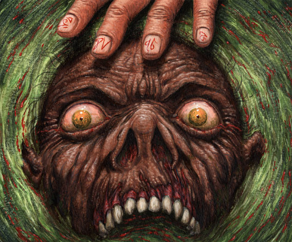
Wow, those eyes are just filled with ferocious hunger. For spicy brains, naturally.
Necromancy is still a favorite of mine because it’s unflinchingly gruesome without resorting to a more obvious approach of blood and gore and entrails (Yum!). The image also really benefits from the coarse watercolor paper I painted it on that added a pleasingly unpleasant texture to everything.
For the next few years following Visions‘ release, I’d often meet someone who commented that they found looking at the image unsettling. Mission accomplished!
Very unsettling image. But a very cool post.