
The Curious Case Covered
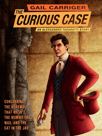
Full title: The Curious Case of the Werewolf That Wasn’t, the Mummy That Was, and the Cat in the Jar
Today I’m taking a look at the creation of the cover for Gail Carriger’s ebook The Curious Case.
If you haven’t already, pop over to Gail’s blog for the story of how this cover came to be. Once you’ve done that, I’ll tackle a few bits in a little more detail…
Back? Okay, on with the show!
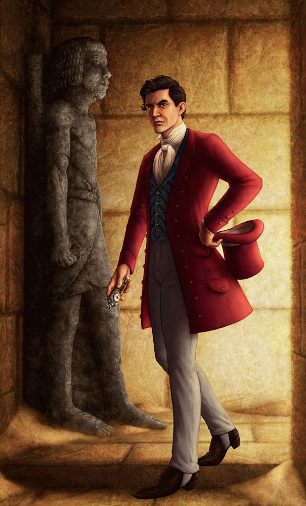
As Gail mentioned, she approached me about doing the cover. I was delighted by the idea because – while I don’t get as much time as I would like to read – I had thoroughly devoured the Parasol Protectorate series featuring Alexia Tarabotti. Intriguingly, this cover was an opportunity to paint her father, Alessandro, a figure who never appears in the books but whose history and reputation are a constant backdrop to the series.
How could I resist?
I read through the story several times. The first time to simply enjoy it, and the other times to make notes about scenes (foreground and background), characters, and most importantly what Alessandro was wearing. Alessandro masquerades as a fop but his love of quality clothing is no charade.
Then, I discussed the options with Gail and we settled on what we both felt was the best scene to depict because it evoked Egypt and was a good moment for a “hero shot” with the added bonus of nice warm lighting. The lighting in the scene is supposed to be torchlight but I had to cheat and make the scene brighter to give it a good readable thumbnail for the ebook sites. While an image with heavier shadows might have been spookier it would have denied us our one good look at Alessandro and it would have been out of step with the style of the paperback covers.
Given that, why are there no torches in sight? Well, one is carried by a character who stands roughly where the viewer is and the others are along the passage casting that strong light on Alessandro’s side. The decision to not include a torch in shot was for clarity and (hopefully) elegant simplicity in the composition. The viewer understands there are sources of illumination without having to drag their eyes away from Alessandro and the looming Ka statue.
Speaking of the Ka Statue, in addition to the many things that Gail explained to me about ancient Egyptian burial customs, I discovered that the statues obey a strict ‘six heads height’ rule. Here’s my reference and my initial drawing of the statue. The head was later re-done as the perspective needed to be as if looking up at the statue.
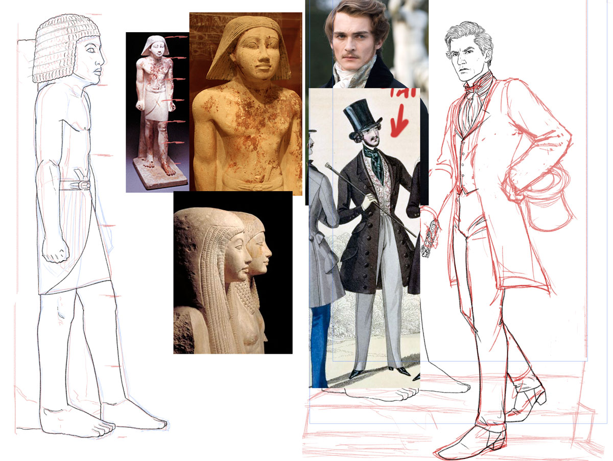
I have quite a lot of costume reference for the Victorian period but – much to my annoyance – I discovered most of it was focused on 1860 to 1900 while the story is set in the first half of the 19th century. So I asked Gail for guidance on the exact cut of Alessandro’s clothes, and she provided me with a selection of images and I did the rest with a little sleuthing via the internet and movies. I also researched cravats and discovered that the one worn by Albert in The Young Victoria is meant to be a particularly tricky knot that was much sought after by the gentlemen of the time. That was of course what I chose to give Alessandro given his high standards. Also, his cravat is white as colored cravats had not really become a thing yet.
You may ask, why go to all this trouble? Well, I feel that if a fiction is grounded in actual history, you owe it to the reader to not blow their suspension of disbelief by dressing someone incorrectly for the period. Of course, I may have gone further than was strictly necessary but I enjoy being as accurate as possible and frankly the research is fun.
So now that we’ve firmly established that I’m a fussy git, let’s take a quick whistle-stop tour of some of the moments in the painting’s creation:
One of the issues that arose was that I had to redo the Ka statue’s head to make it less zombie-like. Thankfully I had the original line drawing to guide me and given that I work in digital, matching color and textures is something that can be accomplished relatively quickly –

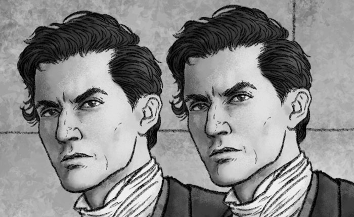
There was a lot of fine tuning to Alessandro’s face both at the line drawing stage and during the painting. Sometimes what works in a line drawing doesn’t translate well when fully rendered and shaded. Other times, the slightest change to an eyebrow or the turn at the corner of a mouth can have subtle but important effects as to how a facial expression reads:
Working digitally also meant that I could slightly rearrange the compositional elements if I needed to. When I first started laying out the composition we didn’t have a clear solution to the story’s exceptionally long title. For maximum flexibility every part of the rear wall was painted and Alessandro and the Ka Statue remained in their own layers until the very final iterations of the cover. Indeed, if you look at these last two steps in the cover’s creation, you’ll see that Alessandro’s position relative to the wall and the statue have changed.
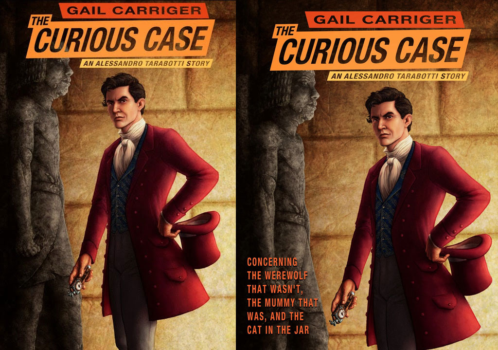
This change was made so that the title wasn’t so cramped against the upper edge of the image while at the same time the title didn’t completely obscure the statue’s face. In addition, the final layout placed the focal character off-center which is consistent with the compositions of four of the five Parasol Protectorate books.
Finally, here is the finished painting in its entirety. I completed the entire image rather than just the area used for the cover as I have Gail’s permission to produce this as a limited edition print of a hundred. Details on how to get the print will be coming soon.
Footnote: Sand can be a real pain to paint. It’s incredibly difficult to find that sweet spot where its edges aren’t too soft, too firm or too granular. Sometimes – oh, who am I kidding, often – it’s the little things that’ll drive you crazy.