From the Vault – Lys Alana Huntmaster (2007) Pt. 1

•March 16, 2012 • 7 Comments

As I mentioned yesterday, sometimes a piece of artwork I’m really proud of is lost to obscurity due to being attached to a common card. It doesn’t even have to be a junk common. Sometimes just being a regular common is enough for the artwork to fall off most players’ radars.

One such piece is Lys Alana Huntmaster from the Lorwyn set. Apparently this card was well received among players sporting elf decks of the time but the art never drew any significant interest.

The artists aren’t told the rarity of the cards they’re assigned anymore, but oftentimes – and with a little experience born of writing every Magic card art description for three years – I can make a pretty good guess. Why is this important? Well, if common cards are the red-headed stepchildren of CCGs, then it makes sense to focus your best efforts on the rare cards as that’s the art players will remember.

With that in mind, I try to make the art that’s destined for a rarer card more esoteric, more gnarly, more detailed or just plain more weird. I think if you’ve got two goblin cards and one’s a common and one’s a rare, regardless of the art description, the common goblin shouldn’t be too far from the average goblin depicted in the style guide, while the rare goblin should be a character, a paragon, an eccentric or a movie star, something that stands out from the herd.

Here’s the art description for the assignment:

Lys-Alana Huntcaller
Color: Green Creature
Location: Lys Alana, a large elvish ‘city’ in the Gilt-Leaf Wood. The Gilt-Leaf Wood is the forest considered most beautiful by the elves. The trees have a sap that elegantly coats the spaces between the bark, and when the sun hits it just right, it seems to be golden and shimmers as if gilded.
Action: Show an elvish noble who’s the city’s ‘master of the hunt.’ He has two striped dogs with him like the one in the styleguide. He’s blowing a ceremonial horn to call other elves to the hunt.
Focus: the elvish huntmaster
Mood: aristocratic, shrewd, elegant

So he’s an elf noble who holds a position of some seniority within this large elvish city? Totally sounds like at least uncommon material to me. If the art description had suggested he was any more important, I would have chosen rare. With that in mind, I start designing an elf who’s very upright and composed, one who has that quiet confidence that assurance of command can bring.

Here’s my first few attempts at the elf’s head;

Huntmaster Head Sketches

At first I was thinking of having the Huntmaster looking off into the distance, overseeing whatever task he was set to, but I soon came around to the idea of him making eye-contact with the viewer to drive home the confidence I wanted to convey. If I remember correctly, the Lorwyn elves weren’t the friendliest bunch which is why #2 is sporting a faint cruel smirk. #3 amps that up a bit to outright distaste. You may have noticed I’ve ejected the idea of him actually blowing the horn. Why? Well, the focus & mood entries in the art description are about how imposing this elf is, not about the activity of blowing a horn. You try to look elegant blowing hard on a wind instrument!

I’d nailed down the figure’s stance earlier and now came time to dress the elf. Lorwyn was a world of eternal midsummer so clothing tended to be sparse or open and airy.

Below is an initial sketch, followed by a figure sketch done digitally that would allow me to apply a variety of separate layers of outfits; the modern-day equivalent of a paper doll.

Figure round 1

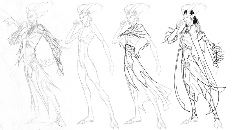
Wow, those elves were thin. Next are a couple of stabs at the outfit. The second option seemed promising so I made several more iterations of the clothed figure…

Figure round 2

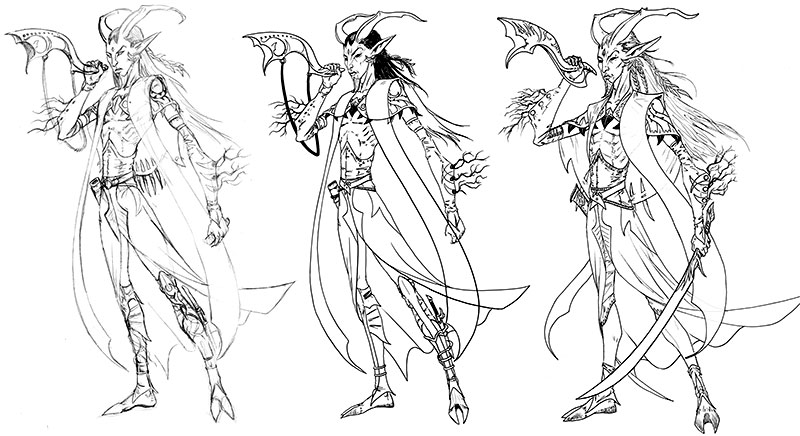
Looking back at these sketches now, I see that with the final version I pruned the design, removing some visual clutter – such as the knife wrapped around the leg – to aid legibility at final card size. For much the same reason, some of the other details became larger, such as the leaf drapery (shown in black) hanging off the cloak as it crosses his upper torso.

Here’s a closer look at the final drawing of the Huntmaster:

Final Figure

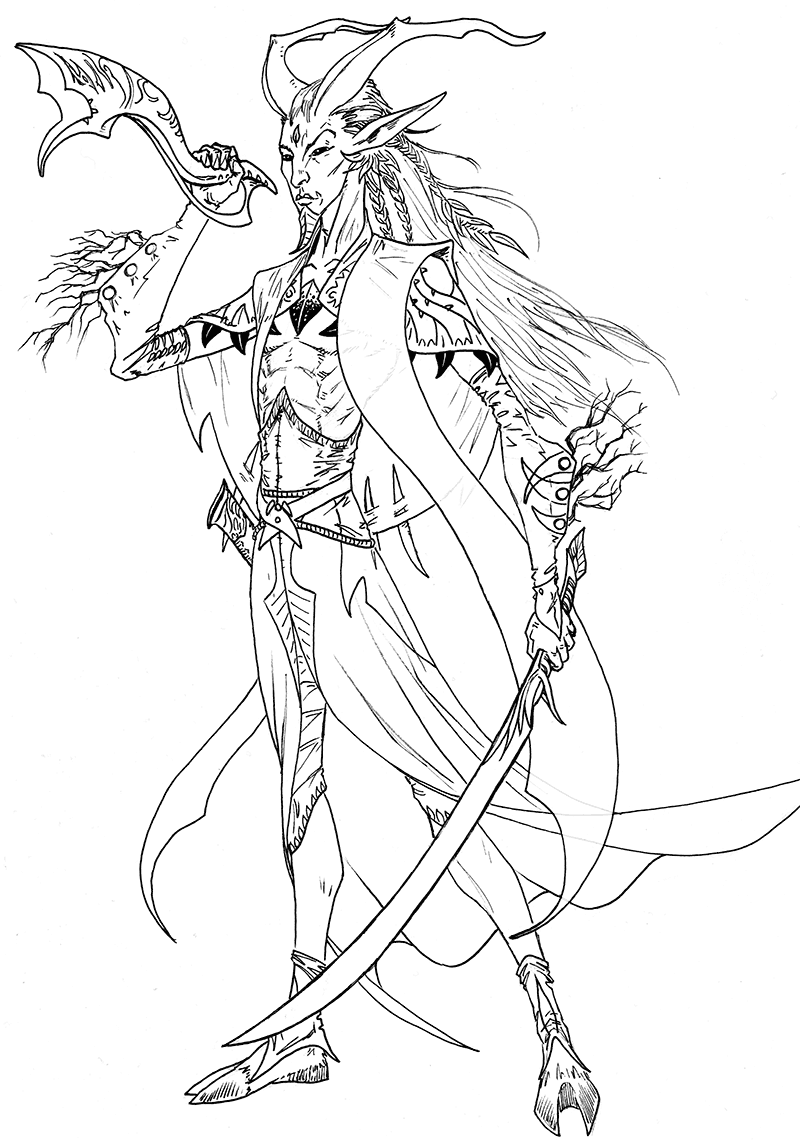
As you can see, his clothing is covered in stylized leaf and vine designs, with the ocasional bladed quality to their shape. Leaves are woven into his hair and form a faux beard too (that was a concept from the style guide I really liked) and even the pommel of his sword is shaped into a leaf design. Twigs are bound into the buttons of his gloves as a small show of ostentation rather than anything symbolic, or so my memory tells me. Finally, the horn is given exaggerated organic curves and bears a passing resemblance to a wyrm.

I’m not sure why I straightened the angle of his head. Perhaps I thought the tilt seemed a little coy and I wanted a more defiant look. Some decisions are pretty subjective and any other day I might have decided differently.

Next time, we’ll get into the actual painting of the gilded forest, and you can see just how easy it is to lose your mind with digital stippling.

Lots of dots

To be continued…

The Curse of Commonality

•March 15, 2012 • Comments Off on The Curse of Commonality

It’s true in every corner of the commercial art world that if your artwork is attached to a popular product then your art is going to benefit from that association. The popularity rubs off, so to speak.

It’s especially the case in Magic, and probably all collectible card games. If your art graces a hot (and most likely) rare card then you’re going to be able to sell more prints, charge more for the artist proofs and if you’re working in traditional mediums, ask a nice sum for the original art too. It’s all about demand.

In CCGs the opposite is also true. If your art ends up on an unpopular card then you may never sell a single artist proof unless you find a particularly masochistic player with a strange connection to the card. Hey, it’s happened…

But it goes further than that, the perceived value – that is to say the quality – of the painting itself is changed in the minds of the card buying public. I have some early paintings that aren’t remotely close to the quality I produce today, but they’re on popular cards and I sell prints of them at every show. And I have some paintings I’m really proud of that’ll never sell a print because of where they landed, usually a junk common that no one cares about.

And that’s the curse of commonality.

Tomorrow (yes, really, three updates in a week!) I’ll show you one of my favorite paintings that you may never have paid any attention to as it was lost to a junk common.

And as a footnote, even commons have their moment in the spotlight…

Image courtesy of the fiendish Magic Cards with Googly Eyes Tumblr where I have discovered my art is featured with frightening regularity.

Man, I think the eyes totally improved the Necrogen Censer. Just look at it, it’s absolutely cute now… like some raggedy left-for-wet Pokemon.

On the Mat

•March 14, 2012 • Comments Off on On the Mat

So GP Seattle-Tacoma was a lot of fun. REALLY busy, though. There was very little time to just hang out chatting as the line never shrank until the last few hours on Sunday.

As well as the playmats produced for tournament prizes, people requesting sketches on their own mats has become the big thing at recent shows. Playmats have been around for ages so I’m not sure why this has suddenly become so popular but I suspect the new mats with their smooth surface that takes drawings much better has encouraged this. Just a hunch.

I lost count of how many sketches I did. Some were certainly better than others – that’s always the case – but hopefully everyone was happy with their pics. These shows can become a blur and I often worry about getting too punchy and producing crappy scrawls.

One of the most bizarre pieces done was a hodge-podge Phyrexian that came about from an impromptu jam. I had drawn the upper portion of a Phyrexian warrior but had to call it at a certain spot when I had run out of time. Later the mat’s owner brought back the mat to show me that rkpost had added a lower torso and thighs to the creature (apparently he hates to see things unfinished) and then he thought he’d leave the legs for Mark Tedin. Franz Vohwinkel was last to get his hands on the mat and managed to bolt on a rather natty mini gun – with requisite ammo belt – to the Phyrexian’s free arm.

Here’s the crazy jam for you to enjoy –

Jam mat drawing featuring Venters, Post, Tedin and Vohwinkel

After the show, Mark and I were talking about doing this again and seeing what craziness happens. Only time will tell…

Finally, here’s a look at the finished Phyrexian Dreadnought playmat with all the noodly rendering completed.

Phyrexian Dreadnought mat finished

A REALLY Big Prize

•March 2, 2012 • 1 Comment

One of the latest things happening at Magic tournaments, especially the new slew of Grand Prix events, is the attending artists producing playmat sketches for tourney prizes.

A lot of times these are done on the day – they are, after all, just a really big sketch – but I decided to have a shot at my mat before getting to the show…

So, if you’re going to Grand Prix Seattle-Tacoma, you could win this Phyrexian Dreadnought playmat:

Phyrexian Dreadnought mat prize for GP Seattle

The Magic card is included for scale! This wide mat also gives me a chance to try out the larger image window on the blog’s new format. Mmm, roomy.

The mat’s about eighty to ninety percent done at this point. I’m sure it’ll be on show with the other artists’ mats during Saturday and possibly a portion of Sunday. Considering rkpost and Mark Tedin are attending, I think it’s fair to say there’ll be some damn nice looking mats to win.

Don’t miss out. Don’t say you weren’t warned.

Event Alert: Grand Prix Seattle / Tacoma

•February 28, 2012 • Comments Off on Event Alert: Grand Prix Seattle / Tacoma

I’ll be attending Grand Prix Seattle / Tacoma this coming weekend. I should be there Saturday and Sunday from about noon onwards (I-5 traffic allowing).

Come along for all manner of signing, sketching and shenanigans.

Click this link or the image for event info and location.

Back From The Dead

•January 30, 2012 • 3 Comments

Man, it’s been two and a half months since I posted here? What’s that, twenty years in internet time?

So, I’m still around, still working the freelancing gig, still keeping an eye out for new work (who isn’t?). The last few months have been filled with seasonal holiday shenanigans, training in ZBrush, swearing at Painter, occasionally dealing with a flooding basement, and trying to deal with a backlog of card signing requests. Y’know, the usual.

So, here’s a quick sketch I did one evening after returning from the upstairs room I call my studio to find my wife watching one of her perennial comfort movies, Beetlejuice…

And when I say quick sketch, I really mean quick. This took four minutes.

Beetlejuice 4 minute sketch

Those of you who’ve seen me sketching at shows, are probably not surprised by that. Attendees who want a free sketch get what I call my “thirty second goblin” which is a goblin head-shot that takes 30 seconds when I’m really in the zone, 50 the rest of the time.

Anyway, I decided I needed to do a better bio-exorcist pic, so here’s a color version I whipped up as a warm-up one lunchtime…

Beetlejuice color sketch

Beetlejuice, Beetlejuice, Beetlejuice! Wait, damn, does that mean I should have done a third sketch? Hmm…

Phoning It In

•November 18, 2011 • 2 Comments

I have a longer post about GP San Diego that I’m working on, but in the meantime I thought I’d share with you the two cases I designed for mine and my wife’s phones –

iPhone Case Designs

The images aren’t stickers they’re actually imbedded into the cases and are nice and solid. We got these done at Uncommon and they did a great job.

The one on the left is based off the designs I did for my wife’s site, Gothic Charm School. The one on the right is a tweaked version of my Skirk Marauder image. No, I can’t make the Skirk one available for purchase as it’s copyrighted to WotC, but one for my personal use is just fine.

So, would you be interested in a phone case with some of my fantasy art? I certainly think it’s a cool new way for people to enjoy my art. Let me know.

Event Alert: Grand Prix San Diego

•November 4, 2011 • Comments Off on Event Alert: Grand Prix San Diego

I’ll be attending GP: San Diego next week! You can expect to find me there prepared for all manner of signing and sketches.

My hours (approximately) –
Friday Nov 11th 12:00 – 2:00, 3:00 – 6:00
Saturday Nov 12th 11:00 – 1:30, 2:30 – 6:00
Sunday Nov 13th 11:00 – 1:30, 2:30 – 5:00

Hopefully, I’ll see you there.

Doom… Doom… Doom on You

•October 31, 2011 • 3 Comments

It’s Halloween, so time for a couple of suitably unpleasant pictures that – bonus! – you’ve probably never seen before.

These images were both called ‘Doom’ and were destined for promo chips for the short lived game Clout which unfortunately folded before enough people could realize the game was so much more than Pogs and that even though some manual dexterity was required, the tactical aspects of the game were surprisingly meaty.

First of all, the one that really speaks to my claustrophobia. This has the unofficial title of ‘Crushing Doom’…

Crushing Doom.

Brr. Still makes me wince.

This next one might as well just have the unofficial title of “Ouch!”

Burning Doom.

Or maybe “That’ll Leave a Mark”.

I find that damage that cuts along lines you don’t expect are always more unpleasant to our jaded slasher-movie-going tastes. That’s why rather than a clean separation of the head the energy slices through the back of the skull, and more importantly along the length of the jaw.

This second piece was also my chance to use acrylic washes working wet on wet to create the energy blast. The green paint was applied first, then washed away and re-applied, rinse, repeat, until the color’s density was sufficient and nicely saturated but the edges were still soft. After leaving it overnight to ensure the green was fully dry the purple was added in washes to maintain the soft blurred edges that sell the gaseous quality of the effect. Perhaps it’s a dragon’s breath weapon?

Working to get a good transition between such opposing colors as green and purple is always tricky because if the purple bleeds too far into the green, no matter what you do it’ll leave a trace and dull the green. I was mostly lucky and it looks like the only issue I had was in the lower right corner.

That’s it for now. Hopefully I haven’t ruined your appetite for all that leftover Halloween candy.

A Toast…

•October 27, 2011 • 1 Comment

… to the second year of the blog – which is finally underway, hey, it was a big deadline! – and to doors which, well you know how it goes; one closes and another one opens.

Or, should you prefer, there’s this toast…

Orcish Settlers.

Orcish Settlers (from 1997’s Weatherlight) was one of those brain-fart ideas for a picture.

Back in ’96 I was leading the team in charge of card-naming and flavortext and I was solely responsible for all the cards’ art descriptions. When this card lost its working title and became ‘Orcish Settlers’ this image jumped fully realized into my brain and I asked if I could be assigned the piece.

Obviously, it’s the goblinoid version of American Gothic by Grant Wood. The orcs’ clothing mirror the original’s and were significantly pushing the envelope on how anachronistic the piece could be within the world of Magic the Gathering. The house was a bigger problem as it would tear that same envelope into confetti.

So, I burnt the house down. And it gave a nice fiery background for a red mana card which was an added bonus. And the card’s power ended up destroying lands, so double bonus!

That just left me with explaining why the house was ablaze. One burnt piece of toast and a guilty look later and I had my punchline.

Still amazed I got away with it, though.